Friday, December 30, 2016

Performing Dissolution

Image X:  Emily Mullin, Untitled (2016)
Three ceramic vases and painted steel shelf, 30 x 18 x 8 inches
Image courtesy Lucien Terras. 

Exhibition review

Lucien Terras.
325 Broome Street (Lower East Side, NYC)
December 8, 2016 - January 29, 2017


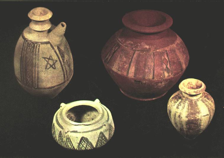
Emily Mullin is a subtle polyglot.  Her works – tableaux of glazed ceramic vases that hold exotic plants, and sit on painted steel shelves – combine elements of ancient Egyptian and Sumerian clay pots, Modernist patterning, machined construction, and hand cut flora so masterfully that days after seeing them at Lucien Terras  I find their effects difficult to shake. The pieces seem simple at first, but gradually deliver an unanticipated experience where rich optics and sharp formal play usurp the primacy of their own materiality.

Featuring a single pot covered in regular, long, fingerprint-shaped patterns and a tuxedo-blue shelf, Untitled (image X) is inviting, odd, and structurally succinct. Like all the pots in the show, this one is smallish and would fit easily in two open hands. Eight fountain-like arms elaborate a facade that works together with wax resist and glaze to form a texturally dense, semi-regular visual pattern running parallel to the piece’s stage-like front edge. Flowers twist upward with violet notes that burn; a counterpoint that foregrounds and amplifies the work’s otherwise low-chromatic air.

Image Y:  Emily Mullin, Untitled (2016)
Two ceramic vessels and painted steel shelf, 30 x 24 x 8 inches
Image courtesy Lucien Terras.

Untitled (image Y) features two plump, Sumerian-style vases. Leaning unevenly, the pair activate space with anthropomorphic charm. Martian red tones and hand-painted, checkered patterns graft the vessels and shelf together, flattening the distance between the middle and background by inviting the eye’s fluid movement back and forth across the forms’ silhouettes. Fresh foliage tucked into one pot offers a vital release of rich green, and the boldness of its counterpoint further intensifies the tableau’s tight visual hold.

Untitled (image Z) would be playfully excessive, if it were not so cooly removed. The piece is challenging, and rewards consideration. Its vivid, peppermint white-and-red, tic-tac-toe scheme borders on acrid. Three short, waffle-cut pots repeat the larger grid pattern. Two of them are set parallel to the front plane, while the third is intentionally shifted, creating a play between fractured, fabricated space and actual space. Red flowers wrench the eye a bit, their round petals blotting and breaking up the tense visual matrix. 

Image Z:  Emily Mullin, Untitled (2016)
Three ceramic vessels and painted steel shelf, 30 x 26 x 8 inches
Image courtesy Lucien Terras.

These works successfully aggregate a broad set of disparate histories, substances and formal devices. Very much like the shallow space of a painting, they weave and bend a convincing optical fabric with threads coursing through a boxed front, middle and background. In each piece the fourth wall is enforced and then broken. Vectors of pattern, color, tone and line flow through everything, dissolving clay and steel into tightly compressed spatial systems. The vessels’ chunky forms and the exotic plants’ natural presence assert “real-ness”, but they don’t compete; the sets absorb them and steal the show.

Mullin’s work is keen in its casual appeal and masterful in its execution. The exhibition staggers by transforming physical elements into raw illusory events. In this way, the works are surprisingly more visual than physical, more virtual than real.

–– Michael Woody

Sunday, December 11, 2016

This is The Cake

Sarah Faux, Swells, 2016, Oil on Canvas

Exhibition Review

Mandy Lyn Ford and Sarah Faux, “Touching in the Dark”
yours mine and ours Gallery
54 Eldridge Street (Lower East Side, NYC)
October 21 – December 11, 2016

Mandy Lyn Ford and Sarah Faux have a sharp, raucous show together. Their work is smartly hung and impressive in its carnality, with strong optical and thematic elements to match. The sensory logic of both artists’ work is as compelling as any you are likely to see.

Sarah Faux’s painting falls comfortably into the sensualist lineage of Tracey Emin, Cecily Brown and Rita Ackermann, but her work isn’t as lofty or removed. Swells features a pair sexually engaged, one participant’s point of view replaceable with our own. Both hover in space and are pressed forward in the picture, engaged in awkward self-display. Their strange, imperfect, impeccably painted bodies offer an immediately accessible version of paint as naked flesh and process as hedonistic event. The pair’s greedy hands are lined in electric colors; one seeks and invites while another (the other’s) works at arousal. The piece comes on with a rich mixture of tightly packed forms and heaped-on paint, suggesting open and familiar intimacy. A fullness and specificity accords with the work’s simplicity, making it feel like an actual memory, a “this looks like someone I know” report that surprises by being both pointed and personal.

Mandy Lyn Ford, 666, 2016, oil paint, acrylic, sparkles, and canvas on wood panel

Ford’s work is, like Faux’s, exceptional in its density. While less overtly erotic, Ford’s pieces have sensual appeal like a fantastic dessert. The work’s conceptual vehicle is a loose but deliberate placement of screens in screens, and paintings on paintings. Ford unleashes the power of these self-referential meta-devices without letting it overwhelm her difficult improvisations in tactile variety: quick, easily circulable images get met with the indisputable immediacy of anthropomorphic embodiment. The work is chaotic and sometimes garish, but it speaks clearly, foregrounding the peculiar dynamics of its material world.


Mandy Lyn Ford, New Wave, 2014, Oil paint, acrylic, sparkle foam and canvas on wood panel

In New Wave, panel, paint, canvas, foam and pen come together in an amorphous object that is as likely sculpture as it is painting. Its jagged edges are paired with regular, horizontal lines etched into its face, referencing its pulpy substrate and also accentuating the full form and subtle turns of its torn, rolling surface(s). There is a strange muscularity in its minutiae and you find yourself exploring corners and crevices with deep, impressed focus – an experience that attests to the artist’s uncommon attention, risk, and hard-won reward. Ford sees to the whole and manages the tiniest bits equally.

Works like these are supported by a history of art that invites materials to perform in certain ways. Both Faux and Ford accept these rich histories, but their works move beyond easy citation. They make leaps from reflection to revelation with persistent insistence and undeniable freshness. The exhibition has gravity, and is as intelligent as it is audacious.

—Michael Woody

Sunday, September 25, 2016

Fresh from the East

Arlan Huang, "Zenkoji Black 6" (2015)
acrylic and oil on mirror plexi, 6 x 6 inches
photo courtesy Lia Chang

Exhibition review

Arlan Huang, "Recent Paintings"
Andre Zarre Gallery
529 West 20th Street
September 8 - 27, 2016

Arlan Huang’s solo exhibition of “Recent Paintings” contains many gems of painterly refreshment. The most stunning are small, square compositions of abstract marks and lines, made during Huang's 2015 residency at the Zenkoji Temple in Nagano, Japan. These 6x6-inch paintings evoke branches of flowers against empty skies. Their casual humor and studied delicacy gets expanded in the larger works in the exhibition.

Huang begins with pre-fab mirrored plexiglass industrially painted in black, blue, gold, green, or silver. He sands them unevenly, and produces surprisingly subtle atmospheric effects by counterposing spare compositions, bright pigments, and thick textures against his burnished surfaces. His finesse with plexi derives from his experience with glassblowingBut working in glass suggests a light touch; Huang paints lush and bold. His quick, deliberate daubs in vivid colors recall Vincent van Gogh’s impassioned impasto in a related scene.  They also resemble the "spontaneous" yet pictorially complex strokes of Chinese brush painting.

Arlan Huang, "Zenkoji Blue 2" (2015)
acrylic and oil on mirror plexi, 6 x 6 inches
photo courtesy Lia Chang

The background colors in Huang’s paintings index lacquers, gilding, and glazes from traditional East Asian crafts. But his abstractions look thoroughly contemporary, and spiced with a hot (fluorescent) red! In titles of larger paintings on sanded plexiglass, “Pink” and “Pinky” refer not to this bright pigment, but to the hand-mixed pale background tint. The wit in these titles matches the red-fluorescent effect: “Still Pink After All These Years” makes faint rosiness dance with the jazzy melancholy of the classic Paul Simon tune to which it alludes. Simon told Dick Cavett that he might add an unforeseen chord to the unfinished song, to create a “refreshing” sound; they agree that repeating such a surprise will quickly make it go stale. So I expected that Huang wouldn’t keep using that wild red…but he does. The real surprise is that this move keeps succeeding.

Arlan Huang, "Still Pink After All These Years" (2015)
acrylic and oil on canvas, 36 x 72 inches
photo courtesy Robert Costello

The exhibition contains one red herring, the elephant in the room. “Non Dimenticar” is an enormous canvas of long lines without smaller marks. The lines riff on Sol LeWitt’s gouaches of undulating horizontals (Huang has been LeWitt’s New York framer for decades). The title, from the song made famous by Nat King Cole, hints at ruminations on times past: this work did begin as one of Huang's “Pink and Blue” paintings of wavering, watery lines. The instruction “Non Dimenticar” — “don’t forget” — functions ironically: Huang’s lines try to obscure something that lurks below the surface, even as it presses toward us from behind the tangle.

Arlan Huang, "Non Dimenticar" (2016)
acrylic and oil on cotton duck, 90 x 72 inches
Photo courtesy Arlan Huang

I wondered whether this unique painting simply should have been omitted. And is its highly worked surface overworked? Perhaps, in relation to Brice Marden’s similarly structured, revised, eastern-oriented paintings. When I imagined Huang showcasing only paintings on plexiglass, however, I saw my error. “Non Dimenticar” reveals the compost that fuels the rest. 

In "Recent Paintings," Huang wrestles not only with art historical antecedents and material/cultural traditions, but also with his own personal and career trajectories (see his interview after winning a 2014 Joan Mitchell Foundation award) as he paints afresh.

-- Karen Schiff

Wednesday, June 15, 2016

Framing the Push

Sharon Brant, “An Uncertain Geometry” (2016) Oil stick and alkyd on canvas, 36 x 48 inches Image courtesy Minus Space
Exhibition Review

Sharon Brant: Paintings 2004 Through 2010
Galerie Tanja Grunert
May 5 - June 18, 2016 (extended)
Brant / Brennan / Zinsser
Minus Space
June 4 - July 2, 2016


Sharon Brant’s paintings, from two distinct phases and in two handsome exhibitions, create palpable forces and spaces. At Tanja Grunert in Manhattan, the hard edges of rectilinear forms mostly hug the borders of small, variously sized rectangular paintings, highlighting the material details of the fabric supports. At Minus Space in Brooklyn, Brant’s more recent paintings stretch the canvases into longer horizontal dimensions, and the painted forms relax into themselves, with rougher lines and a more limited palette. Travel across boroughs offers you a mini-survey of powerfully “empty” fields.

Immediately upon entering Galerie Tanja Grunert, I was struck by Brant’s understated command. The artist sometimes coats her fabric supports with a clear medium; sometimes she articulates them with all-over, lush, white brushstrokes through which the raw fibers seem to be straining to surface. These textures become highly noticeable because Brant outlines the space of the canvas using carefully applied, thin lines of colors (black, the primaries, silver) which boldly offset the raw fabrics’ hues: straw, jute, sackcloth, and clay. Her outlines trace the edges of the rectangular pieces, or create a square or rectangle within the larger field. Either way, your attention is made to focus more precisely than in Jo Baer's outlined fields: Brant’s paintings are small enough that you perceive tiny details such as warps in a linen weave, slight diagonal deviations within the border lines, nubs of congealed paint, a crease in the underlying canvas. Works in the back of the exhibition substitute porous graphite lines for the wide painted ones, foreshadowing Brant's movement toward edgeless, drawn forms.

In contrast to the earlier, tentative airiness of the graphite lines, current paintings in the Minus Space exhibition play at full throttle, weaving black or carmine gestural forms into heavily worked white surfaces. They appear to be figures on grounds, but are they? The “background” textures are as malleable and charged as those of the color-saturated lines and shapes. No wonder she calls these works “uncertain geometries”... When Brant layers white over some painted lines, the underlying colors simmer with occult force. While the earlier works had reversed the figure-ground relation, now form and negative space are in constant, fluid interchange. Brant reveals the insistent quality of all matter -- solid (shapes), liquid (paint), or gas (“backgrounds”). And now, when she obscures lines that limn a horizontal edge (don’t miss the painting in the office), the half-buried borders indicate hidden layers of deepened space.* I think of Susan Hefuna’s layered grids, Terri Rolland’s wicket shapes, and the expert freedom of Katherine Bradford’s brushwork.

Coincidentally (?), all the artists I immediately imagined as Brant’s reference points are women. From 1989 until 1996, when she was in her 40s, Brant was a member of the A.I.R. Gallery, created by and for women artists. If Brant's strong, sensitive technique is dubbed feminist / female, is the work constrained or enriched? In any case, now that the New York Times is trending seasoned and laudable women artists, Brant too deserves more recognition.
– Karen Schiff

* The hints of color that sometimes line the outer edges of Brant’s canvases are echoed in Michael Brennan’s oil paintings of ghostly effects on the opposite wall. And while these bodies of work support each other, John Zinsser’s large red square gives the room a center of gravity. (At Tanja Grunert, Brant’s paintings are also presented with other artists’ works, but there the space is organized so that each has a separate exhibition.)

Sharon Brant, “Nov. 9, 2008” (2008)
Acrylic and graphite on linen
Image courtesy Galerie Tanja Grunert

Sharon Brant, "An Uncertain Geometry" (2016)
Oil stick and alkyd on canvas, 18 x 72 inches
Image courtesy Minus Space


Friday, June 3, 2016

Oil And Water

Patrick Shoemaker, Hindrance, 2016
Oil on canvas, 46 x 44 inches
Image courtesy Anna Zorina Gallery, New York
Exhibition Review

February 25 – April 2, 2016

Figures intertwine in Patrick Shoemaker’s paintings, yet it is unclear if any given interaction is a dance or a fight. In Hindrance, a couple tilts this way and that, swinging vertiginously against an ochre background. Are the two locked in a tango, or are we witnessing the final blow of a wrestling bout? The painting’s title suggests the second, but the image looks incongruously joyful. In other works in this exhibition, the contest is between a person (or multiple people) and an animal, such as in Beast Beating, where five figures dressed in glowing yellow, red, and blue, grapple with a bear-like animal against a maroon and pink background. Altogether “Fire On Fire,” the artist’s first-ever solo exhibition, featured fourteen small to medium-sized paintings ranging from 15x13 inches to 58x58 inches.

While the works are not exactly narrative, visual themes and archetypes recur, including the fire of the show’s title. Flower forms crop up throughout the paintings, perhaps more symbolic than real, since they always conform to the idea of a cartoon rose or a tulip shape. Water takes on the feeling of a freighted symbol: Bringing Water is a close-up of a person carrying what looks like a book, but could be a fire bucket. The figure in Soft Traipse certainly carries a bucket. Translucent layers in the paintings look like water as they interact. Many works contain “rays” like those in Charles Demuth’s My Egypt, where the picture is sliced into subtly different-colored wedges. In Pour, one of the larger works, such a layer turns objects a different color, from burnt sienna to pinkish beige.

Shoemaker’s surfaces are thickly painted in oil so that no texture of the canvas shows through. The compositions fit tightly together like jigsaw puzzles. Surfaces are glossy, but at the same time soft. Contours are blended with a dry brush to leave feathered, irregular edges, and colors glow through the shallow spaces between different layers of depth. Shoemaker’s figurative paintings recall Milton Avery’s: solid planar backgrounds, broad simple shapes, and figures with no faces. Like Avery, or Bob Thompson, he uses colors with lots of white added to them. Rather than being pretty, here the colors create a somber effect.

Sometimes the artist uses background patterns that gesture toward Matisse, as with the rough plant-like forms of Zig Zag. The lower part of Red Boot is taken up by a shape that echoes one of the modernist master’s cut-outs: palm or seaweed, divided into sections of pink, green, and blue. The unmodulated flatness and anonymity of Shoemaker's shapes and figures, instead of making them generic, allow them to feel universal and timeless, even iconic. The paintings grab hold of you quietly and insistently, and their vibrations mesmerize. Shoemaker manages to evoke something ghostly, wistful, and genuinely moving.

--Jeff Frederick


Patrick Shoemaker, Beast Beating, 2015
Oil on canvas, 48 x 46 inches
Image courtesy Anna Zorina Gallery, New York


Patrick Shoemaker, Pour, 2016
Oil on canvas, 54 x 44 inches
Image courtesy Anna Zorina Gallery, New York